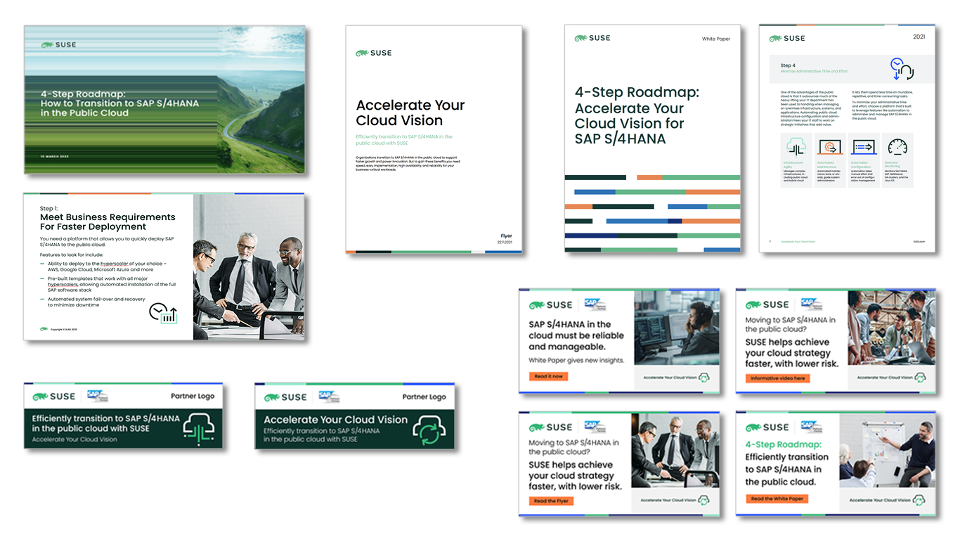
SUSE Cloud Migration Campaign
Video, PPT, white paper, flyer, social and targeted banner advertising to drive sales of SUSE Cloud technology adoption within SAP enterprise space.
Aptum Rebrand 2019
Cogeco sold their internet service provider, business wing 'Cogeco Peer 1' to Digital Colony which wanted a complete rebrand to distance themselves from Cogeco. They commissioned a UK firm to rename the company to 'Aptum Technologies' and design the new logo. StrategicAmpersand was asked to present a proposal for the rebrand after winning the PR business for the new company launch. After receiving the new logo design from the UK firm, I thought we should present an alternative where the letterform was cleaned up to offer a more contemporary feel and suggested a colour change to give more contrast and achieve a less dated feel as well. Aptum approved my proposed design alt before it was submitted for registration.

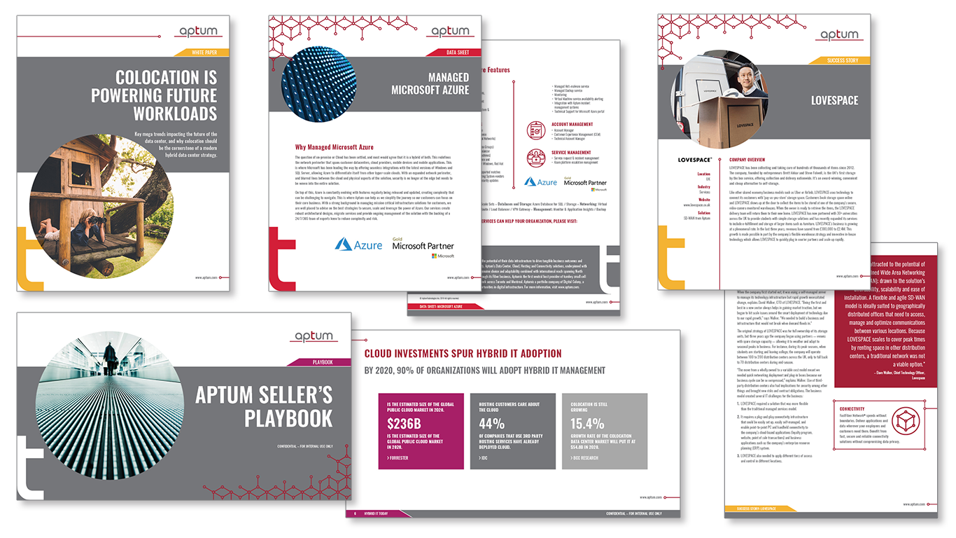
The following is a few pages from the 28 page brand guidelines I created. Because they are a technology company and already had the emphasis on the 't' in the logo I thought it made sense to use that as a key brand element. Images would be presented in a circle or 'porthole' as it was derivative of the logo's rounded letterform. To break away from typical internet service provider imagery Cogeco Peer 1 (now Aptum) and their competitors were using, I suggested using natural metaphors to depict the core values of Aptum: Adapt, Inspire, Grow, Connect and Community. The grid pattern was derivative of the red underline in the logo and was created to help reinforce Aptum's key deliverable: Connectivity.
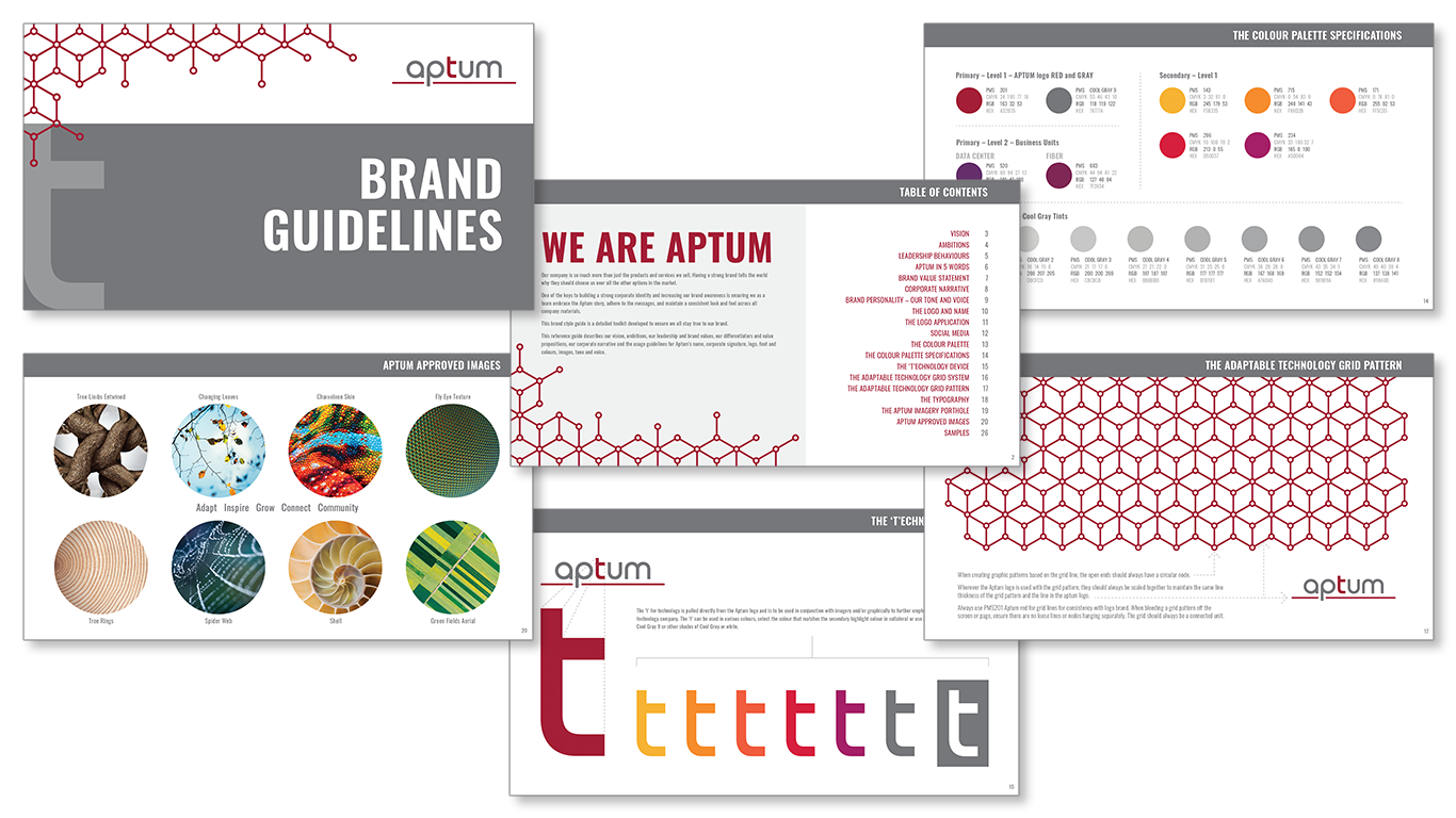
Here are a few samples of the collateral design where I've applied the new branding. I've rebranded over 300 pieces since the new brand was approved, including white papers, data sheets, success stories, sales playbooks, technical descriptions, etc. All final pieces we're delivered as clickable pdfs and packaged source files.
L'Oreal Paris Canada Media Event
One of many campaigns designed for Loréal Paris Canada media events for product launches – media e-invite, print dossier outlining new products, PPT presentation, event signage, sticker.

Critical Path – Memova Rebrand
Concept to rebrand Critical Paths' key product 'Memova' which is mobile OS building block infrastructure for mobile app. development. Introduced the hexagon pattern to support the existing 'Bee and Swirl' graphic, representing the building blocks depicting the products' main focus. Created brand usage guide, selected new image library, established new graphical and typography treatments, designed all new collateral from print to digital.
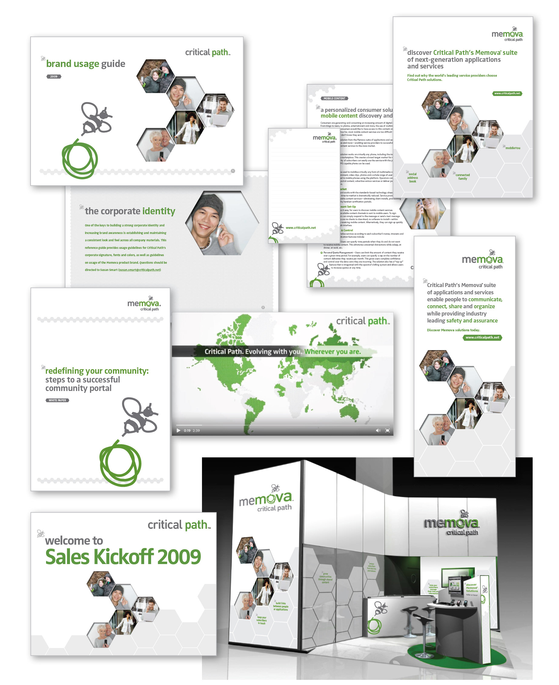
Concept, Design, Art Direction & Music Source for Critical Path Introduction Video at Mobile World Congress
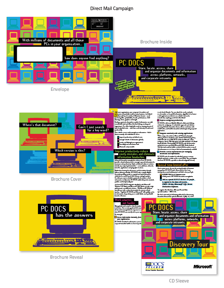
PC Docs & Microsoft Direct Mail Campaign
Concept, design & format to print – Direct mail campaign on minimal budget for PC DOCS and Microsoft including CD sleeve for product demo
Logo for Aptum Annual Technology Conference
Logo for Aptum Internal Sales Leaders
Logo for low and high-rise condominiums furniture and fixture procurement design company.

Logo for import company specializing in natural foods and other consumer products

Logo for gourmet food product line, based on top view of stove, ELK stands for Elizabeth 'Liz' Kalil, established corporate incentive company owners' name.
Logo for York University affiliated athletic club.
Logo for technology company that builds software for document processing in enterprise systems
Logo for wine enthusiast partners
Logo for international, technology business leaders event website

Logo for website and e-newsletter to high level banking partners of Scotiabank

Logo for charitable organization sponsored by Volvo
Logo for start-up technology firm specializing in connectivity, software development for mobile